Cloudiness

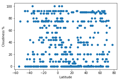
From the graph, it doesn't seem like Latitude and Cloudiness correlate.
That being said, it is interesting how seperate horizontal lines are showing up across the graph. It would be good to see if rounded percentages were used for this graph. There looks to be a line actually around every 5%


