Max Temperature
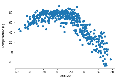
This graph shows how temperature increases closer to the equator. Additionally, we can see how the curvature is not a standard bell curve. Is seems like the southern hemispheres temperature is decreasing at a slower rate, when compared to the northern hemisphere.
Visualizations